Is CSS Dead? Building Modern Apps with Component Libraries Alone
In this blog, which has been a long time in the making, I will cover a topic that has caught my attention for a while now: how enterprise companies are slowly shifting from creating custom applications from a styling point of view to using library components that offer out-of-the-box, pre-styled elements.
Although this blog will primarily focus on the technical aspects of building modern applications using component libraries, it is also highly relevant for product managers, startup founders, and anyone looking to create or manage digital platforms. Understanding the trade-offs between relying on pre-built libraries versus custom CSS can impact not only development speed but also long-term scalability, user experience, and brand identity. For decision-makers, being aware of these technical considerations helps ensure better collaboration with development teams and more informed choices around the design and functionality of their platforms.
Summary:
- Introduction: The Rise of Component Libraries
- Advantages of Building Apps with Component Libraries
- The Role of CSS in a Component-Driven World
- Design Limitations with Pre-Built Component Libraries
- Performance Implications
- Learning Curve: CSS vs. Component Libraries
- Long-Term Maintainability
- Component Libraries vs. CSS-in-JS Solutions
- Real-Life Use Cases: When to Use Libraries vs. Custom CSS
- Future of CSS: Can Component Libraries Fully Replace It?
- Introduction: The Rise of Component Libraries
Component libraries have rapidly become a cornerstone of modern front-end development. Frameworks like Bootstrap, Material-UI, and Tailwind CSS offer a set of pre-designed, reusable components that allow developers to build complex user interfaces quickly.
These libraries streamline the development process by providing ready-made solutions for common UI elements such as buttons, forms, navigation bars, and grids, eliminating the need to write extensive custom CSS from scratch. The rise of component-driven development, especially with popular front-end frameworks like React and Vue, has shifted the focus away from writing custom styles to assembling and customizing components.
This evolution has sparked debates within the developer community, with some questioning whether CSS as we know it is still necessary, given the power and flexibility of component libraries. At the same time, while these libraries enhance productivity, they can introduce design uniformity and limit creative flexibility, making the balance between using them and crafting custom styles an essential consideration in modern app development.
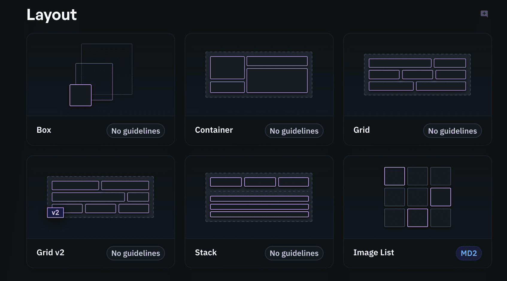
Example of compact MaterialUI code:
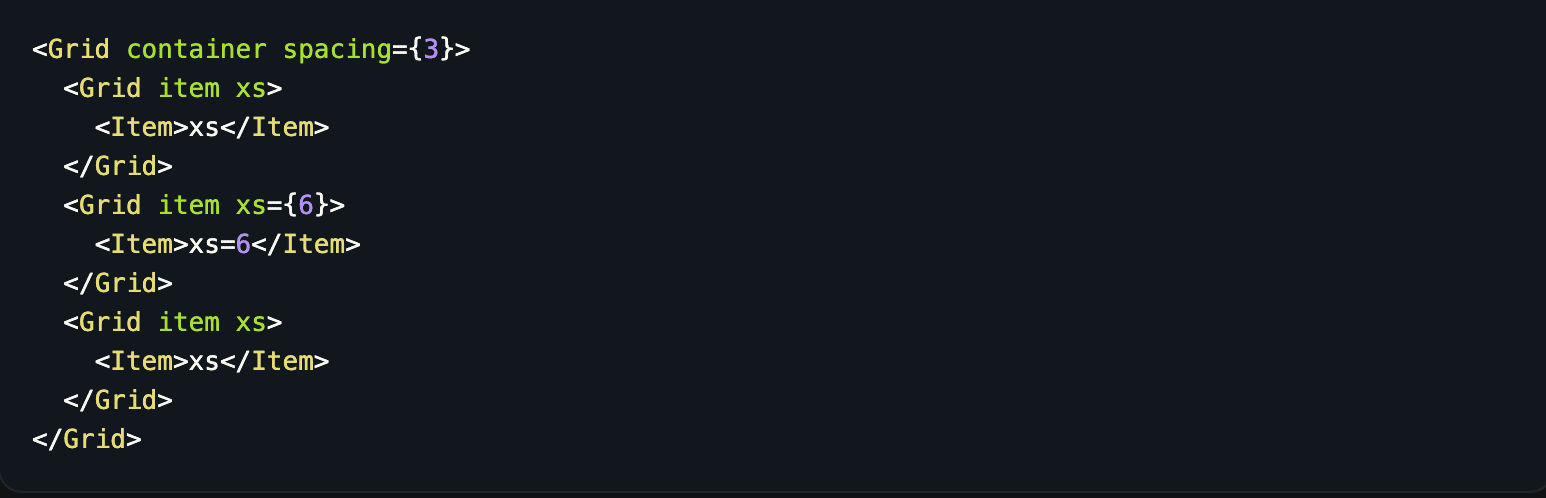
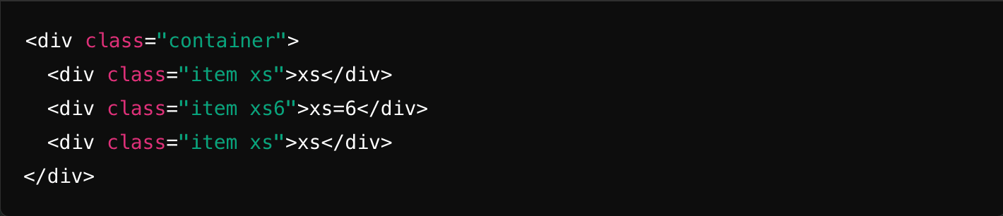
Same implementation, but using custom HTML + CSS: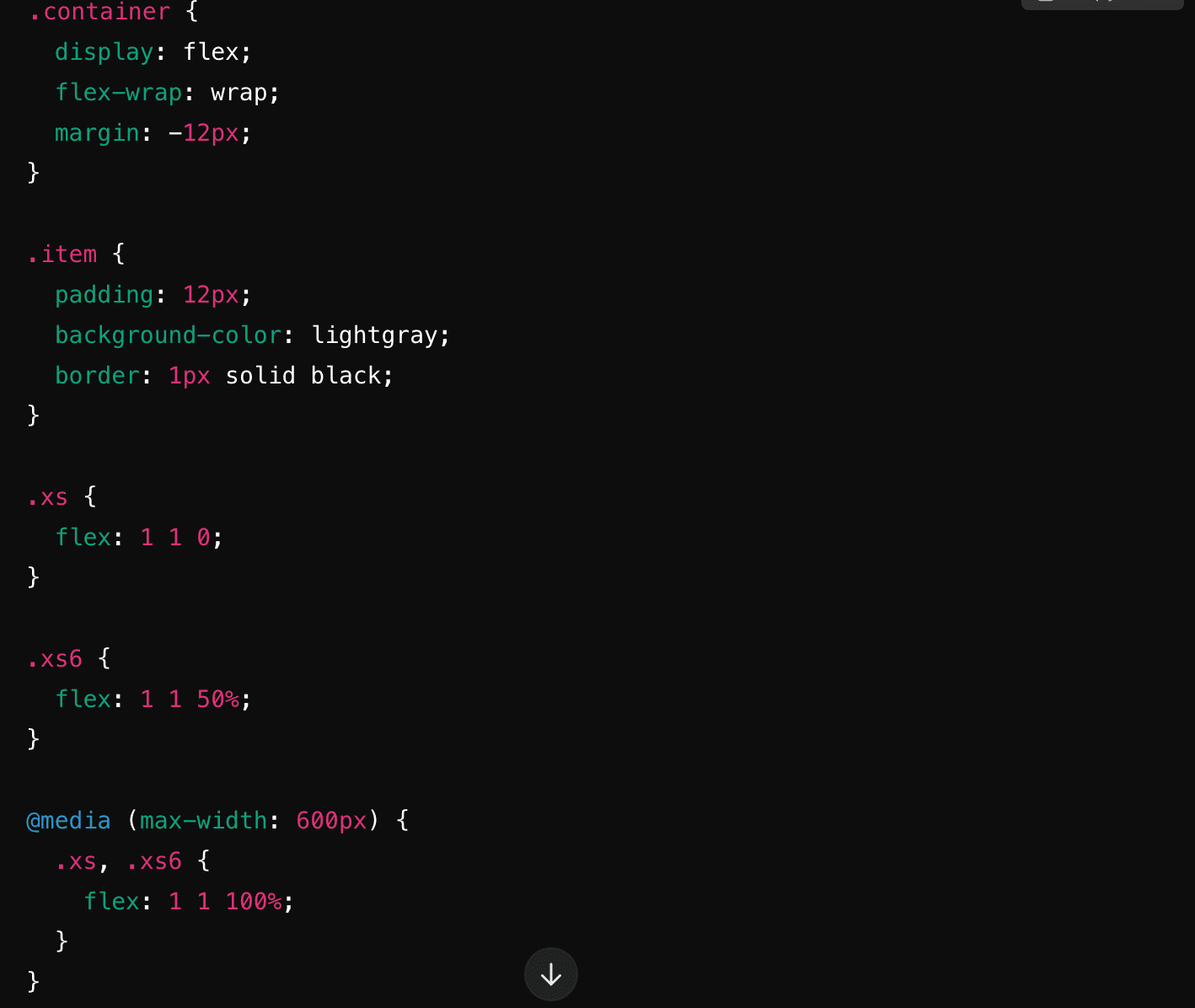
- Advantages of building apps with component libraries
One of the biggest advantages of using component libraries is the efficiency they bring to the development process. By providing a collection of pre-designed and pre-tested UI components, libraries like Bootstrap and Material-UI allow developers to quickly assemble interfaces without having to write extensive custom CSS.
This speeds up development time significantly, making it easier to prototype, iterate, and deploy applications. Additionally, these libraries often come with built-in responsiveness and cross-browser compatibility, ensuring consistent user experiences across different devices and platforms.
For teams working on tight deadlines, this can be a game-changer, allowing them to focus more on functionality and logic rather than reinventing the wheel with every UI element.
Once the development is done, library components are easily maintained and expanded. Since they are standardised in the way they are implemented and used, they minimize the risk of having very custom and hard-to-understand code.The ramp up for new developers is thus greatly reduced, resulting in increased efficiency.
However, the trade-off is that apps may lack a unique design identity, as these libraries promote a common visual language that can lead to a "cookie-cutter" appearance if not customized. Balancing the use of these libraries with thoughtful design enhancements becomes crucial for developers seeking both efficiency and originality.
- The Role of CSS in a Component-Driven World
While component libraries offer a powerful and efficient way to build modern web applications, CSS still plays a fundamental role in shaping the look and feel of these applications. Component libraries like Material-UI or Tailwind are built on top of CSS, and understanding CSS concepts is essential for developers who want to go beyond the basic functionality of these libraries.
For instance, if a pre-built component doesn't perfectly align with a designer's vision, developers often need to use custom CSS to modify the component's appearance or behavior. This is where a solid grasp of CSS becomes crucial. Without that knowledge, developers may struggle to achieve the level of customization required for a unique, branded user experience.
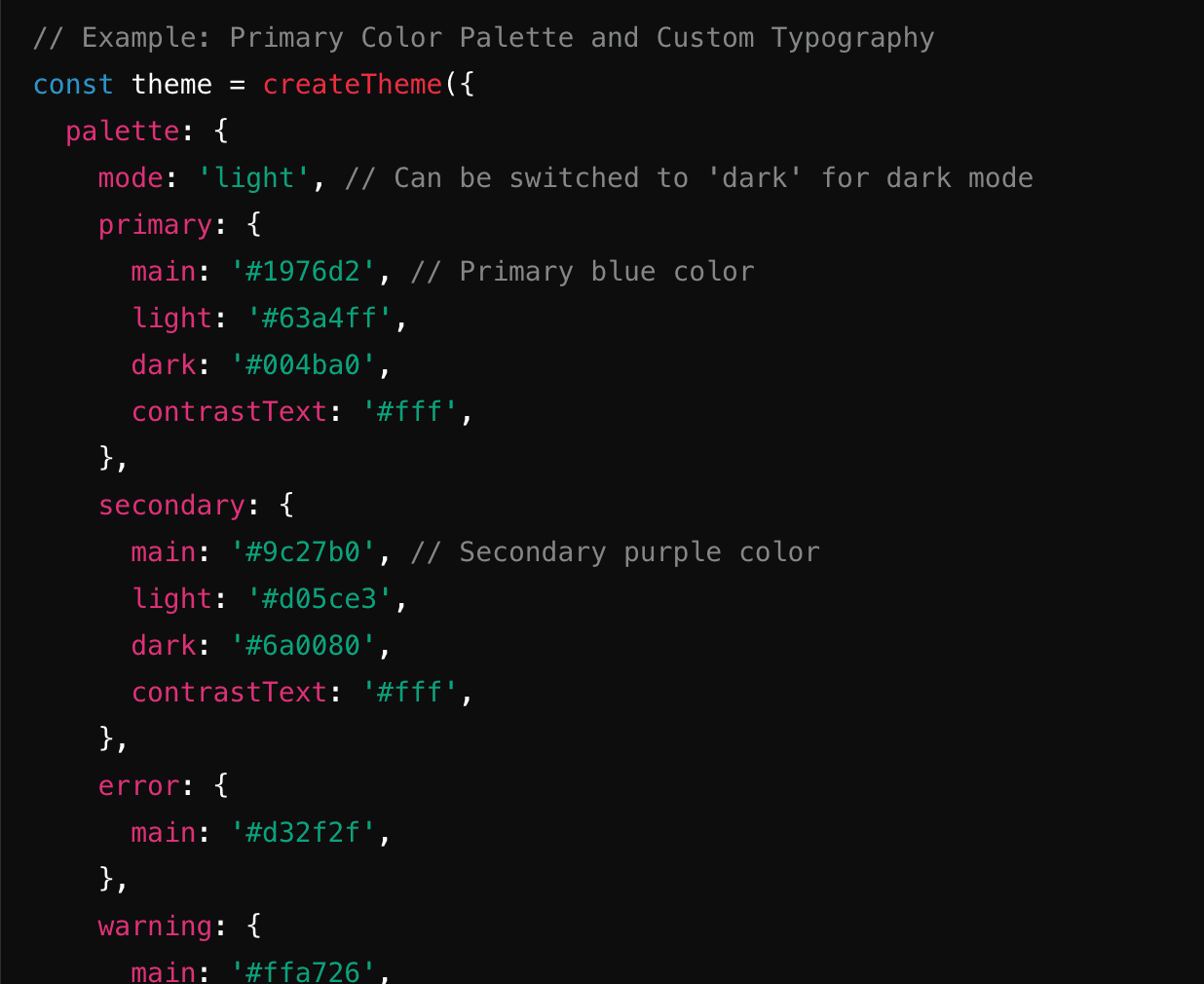
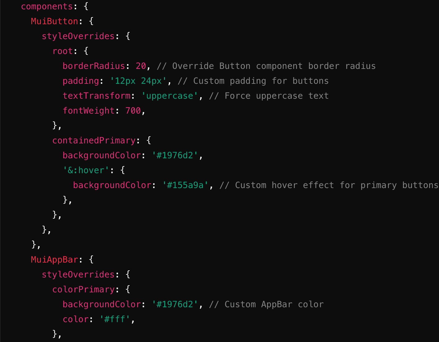
Most of these libraries offer a theming option, where developers can jump in and modify the look and feel of the provided components. For example, in MaterialUI, one of the most famous library components, theming would look something like this:
Additionally, component libraries, while versatile, may not cover every possible UI need or interaction, especially for more complex, niche designs. CSS allows for a greater degree of flexibility when it comes to animations, transitions, and fine-tuning layouts that libraries may not fully address.
However, relying on CSS can also introduce challenges, such as increased complexity in managing styles, particularly in larger applications where overriding or modifying library components can lead to inconsistency or difficult-to-maintain code.
Balancing the use of component libraries with custom CSS requires careful attention, and developers must weigh the ease of using pre-built styles against the need for precise, customized control over the user interface. In this way, CSS remains an indispensable tool in the modern development toolkit, even as component-driven design continues to grow in popularity.
- Design Limitations with Pre-Built Component Libraries
Component libraries are incredibly useful for speeding up development, but they come with design limitations that can hinder creativity. Since these libraries use standardized components, apps built with them often end up looking similar, which can make it difficult for products to stand out visually. While customization is possible, modifying pre-built components can be tricky and time-consuming, often requiring developers to override default styles or write custom CSS. This can lead to code bloat or style conflicts, reducing maintainability. Additionally, libraries may not cover niche or complex design needs, forcing developers to create custom solutions, which defeats the purpose of using them for efficiency.
This comes in the end at the business decision of building the UI fast, in a standard fashion and applying only theming to it, or have a custom made, unique UI which comes at the price of extra time.
- Performance Implications
While component libraries provide a quick and easy way to build UIs, they can introduce performance challenges, particularly in terms of code bloat and overhead. Most libraries, like Bootstrap or Material-UI, come with a wide array of components and features, many of which may go unused in a particular project. However, because these libraries often bundle all their CSS and JavaScript together, including unused components, the overall bundle size can grow unnecessarily large. This additional weight can slow down page load times and affect the overall performance of the app, particularly on mobile devices or in regions with slower internet speeds.
Additionally, some libraries may include complex CSS selectors, heavy animations, or extensive JavaScript dependencies, all of which can contribute to rendering delays and degraded performance. For example, using a large library for simple components, such as buttons or forms, could result in a lot of unused or redundant code being loaded.
Frameworks like Tailwind CSS attempt to mitigate these issues by offering a utility-first approach, where only the classes and styles actually used in the project are included in the final build. However, even with these optimizations, developers still need to be mindful of how much of the library they're using and whether they're including unnecessary components. Furthermore, adding custom CSS on top of the library can complicate performance management, as developers need to ensure their additions don’t conflict with or override existing styles inefficiently. To maintain optimal performance, careful consideration must be given to the choice of libraries, how they are used, and whether they align with the specific needs of the project without introducing excess overhead.
- Learning Curve: CSS vs. Component Libraries
Component libraries simplify development by allowing developers, especially beginners, to quickly assemble UIs without needing deep knowledge of CSS. They reduce the learning curve by offering pre-built components, enabling developers to focus on functionality and application logic rather than the finer details of design. This makes them particularly useful for rapid prototyping or when working under tight deadlines, as they allow for the creation of consistent, functional interfaces with minimal effort. Libraries streamline the process, making it easier for teams to produce polished UIs without a steep learning curve.
However, relying too heavily on these libraries can limit a developer's understanding of CSS fundamentals. When unique or highly customized designs are required, the lack of a solid CSS foundation can become a roadblock, as developers might struggle with custom layouts, responsiveness, or advanced styling needs. Additionally, mastering a specific library’s API or theming system doesn’t always translate well to other projects, making it harder to switch between frameworks or tools. Without a solid grasp of core CSS concepts—like specificity, the box model, or flexbox—customizing and troubleshooting pre-built components can be difficult and lead to inefficient solutions. Balancing the use of component libraries with building a strong foundation in CSS is essential for long-term development flexibility and the ability to handle more complex projects as they arise.
- Long-term maintainability
Using component libraries can speed up initial development, but they can present challenges for long-term maintainability. Libraries like Bootstrap, Material-UI, and Tailwind CSS are widely supported, ensuring regular updates, bug fixes, and new features. This helps keep your app aligned with the latest design trends and browser standards, reducing the need for developers to manage these updates manually.
However, relying on external libraries carries risks, such as deprecation or breaking changes in future updates. If a library undergoes significant changes, developers may need to refactor large parts of the codebase, potentially introducing technical debt. Moreover, as project needs evolve, excessive customizations to the library’s components can complicate maintenance and testing, making it harder to keep the project organized and efficient.
Another challenge is onboarding new developers. A mix of custom styles and library components can create confusion, especially in large projects. Over time, the library may no longer meet the project’s needs, requiring a shift to more custom or modular solutions. To ensure long-term sustainability, teams should balance using libraries with creating custom solutions, staying adaptable to project growth while minimizing future technical issues.
- Component Libraries vs. CSS-in-JS Solutions
In modern web development, component libraries and CSS-in-JS solutions are two popular approaches for managing styling. Component libraries like Bootstrap and Material-UI offer ready-made UI elements, which allow for rapid, consistent development. They are ideal for projects where speed and uniformity are key, but customizing them can be challenging, often requiring developers to override default styles, which may lead to bloated or conflicting code.
CSS-in-JS solutions, such as styled-components or Emotion, offer more flexibility by allowing developers to define styles directly within JavaScript components. This approach keeps styles scoped to individual components, solving common CSS issues like specificity conflicts and style leakage. It’s particularly useful for dynamic styles tied to component state. However, CSS-in-JS can introduce performance concerns, especially when rendering many components, and it requires developers to be proficient in both JavaScript and CSS.
Ultimately, component libraries are great for fast, structured development, while CSS-in-JS offers more control and flexibility for custom or dynamic designs. Depending on the project’s needs, a combination of both approaches may be the best solution, balancing efficiency with customization and maintainability.
- Real-Life Use Cases: When to Use Libraries vs. Custom CSS
Choosing between component libraries and custom CSS depends on project requirements, complexity, and goals. Each has strengths suited to different scenarios, and knowing when to use each can streamline development.
When to Use Component Libraries
Component libraries like Bootstrap or Material-UI are great for projects needing speed, consistency, and efficiency. They’re ideal for rapid prototyping or MVPs, where quick development is crucial. Libraries also excel in enterprise applications or internal tools, where the focus is more on usability than custom design. For teams with varying skill levels, libraries offer an easy-to-follow structure, allowing even less experienced developers to build professional interfaces quickly.
When to Use Custom CSS
Custom CSS is best for projects requiring unique designs or complexity that libraries can't deliver. Brand-heavy sites or interactive experiences benefit from the creative freedom of custom CSS, allowing precise control over the design and interactions. It’s also ideal for performance-focused apps, where minimizing code bloat is crucial. Custom CSS can streamline responsive layouts and reduce unnecessary code, making the app faster and more efficient.
Combining Both Approaches
In many cases, teams combine libraries for basic structure and custom CSS for branding or specific features. This hybrid approach offers efficiency while maintaining unique, tailored designs. Ultimately, the choice should reflect the project’s needs—use libraries for speed and consistency, and custom CSS when customization and performance matter most.
- Future of CSS: Can Component Libraries fully replace it?
While component libraries have become essential tools in modern web development, it’s unlikely they will ever fully replace CSS. CSS remains the foundation of web styling, offering unmatched control and flexibility for designing custom, unique user interfaces. Component libraries, though powerful, are built on CSS and often serve as a layer of abstraction to speed up development and ensure consistency. However, they come with limitations when it comes to deep customization, performance, and handling edge cases. As web design continues to evolve, CSS will remain vital for crafting highly tailored experiences, while libraries will continue to complement it by simplifying routine tasks. The future lies in balancing both—leveraging component libraries for rapid development and CSS for fine-tuning and innovation.
Website: https://www.tech-breeze.com/
Instagram: https://www.instagram.com/techbreeze_it/
Facebook: https://www.facebook.com/profile.php?id=100076224582882

Share
Discover our recommended articles


APP
•AGRICULTURE INDUSTRY
•AI
7 min read
From Hive to Screen: How Our App Can Save the Bees
Author: Eugeniu Semenciuc

APP
5 min read
Writing your first CV: tips and tricks
Author: Bogdan Bora

APP
•AI
3 min read
AI and Medicine: A Partnership Saving Lives
Author: Eugeniu Semenciuc

APP
•DIGITALISATION
5-10 minutes
Why digital transformation is no longer optional - PART 1
Author: Bora Bogdan

DIGITALISATION
5-10
Why digital transformation is no longer optional - PART 2
Author: Bora Bogdan